3. Dashboard Environment
In DISQOVER, dashboards are a visual summary of search results. They are a dynamic way of representing your results and their properties, enabling visualizations and further refining of your search using facet filters. The goal of a dashboard is to see relevant information about your search results at a glance so you can quickly navigate through the search. Once you have refined your dashboard and selected the most promising search results, you can leverage the power of linked data, and continue your search to related instances in other canonical types, creating new dashboards that each represent a logical step in the search journey.
One of the strengths of the dashboard environment is its adaptability: almost every element (or widget) on the dashboard can be modified depending on the intended use. Properties that are configured to be used for filtering or visualizing data provide the basis of the widgets and are called facets. There are ready-made dashboard templates available that show widgets for the most relevant facets for each canonical type. However, you can quickly adapt them or configure your templates for future use. In this chapter, the default dashboards available in the public version of DISQOVER are used for all explanations, but the same principles apply to all versions.
3.1. The dashboard
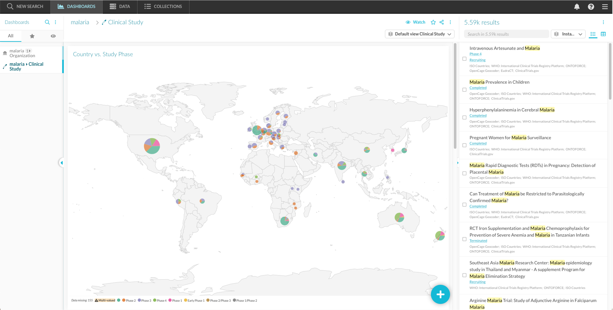
After performing your initial search, you are redirected towards the dashboard environment (Figure 3.1), which consists of several elements.
- Dashboard overview
- “New search” button
- Your dashboards
- Current dashboard
- Dashboard title, by default the current search journey
- Option to open a new (default or custom) dashboard template for the current result set (
 )
) - Dashboard menu (
 )
) - Widgets
- Add a widget (
 )
)
- Instance list
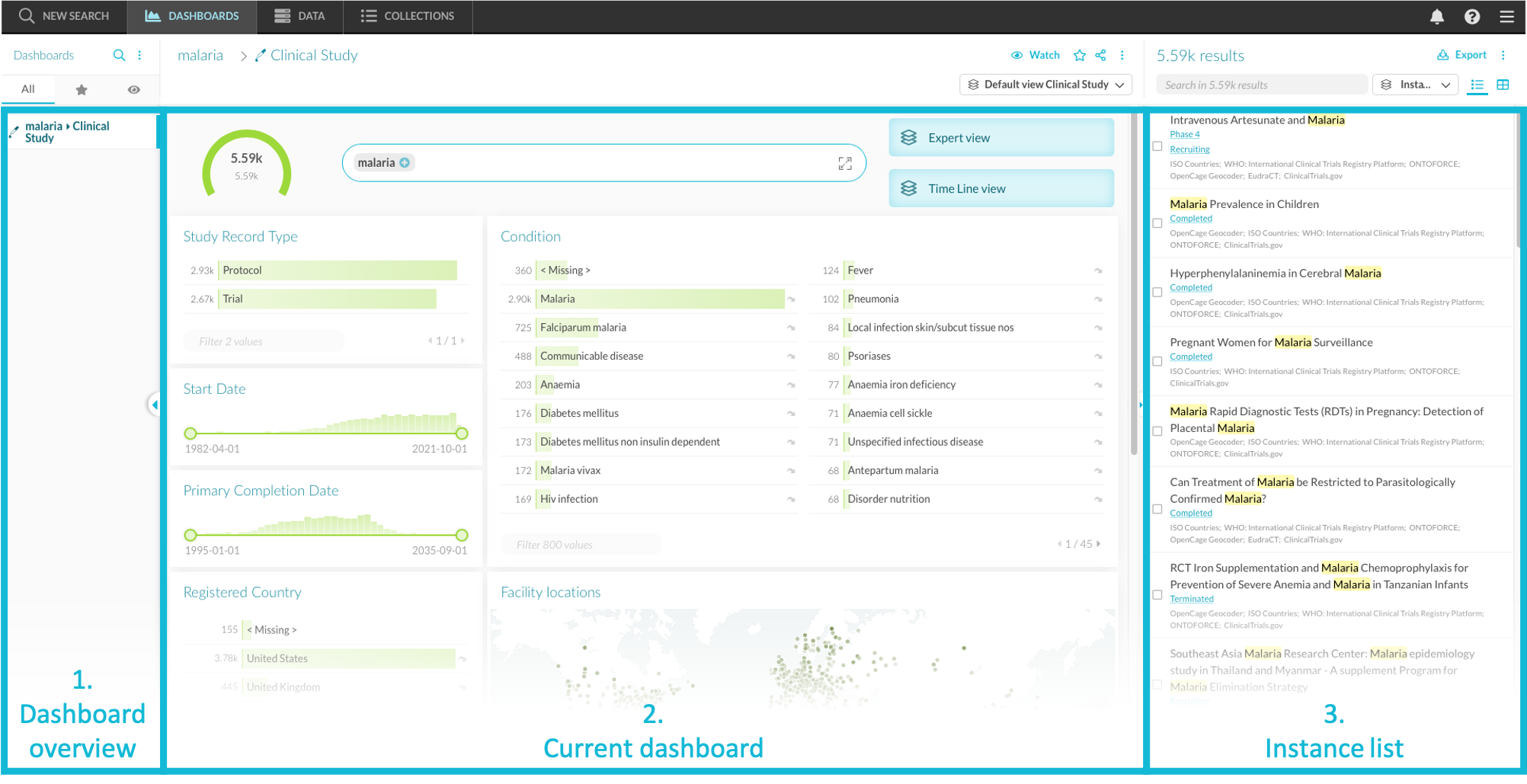
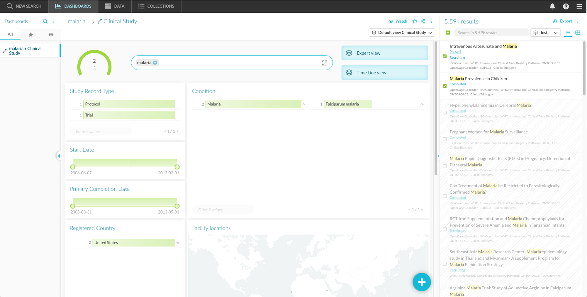
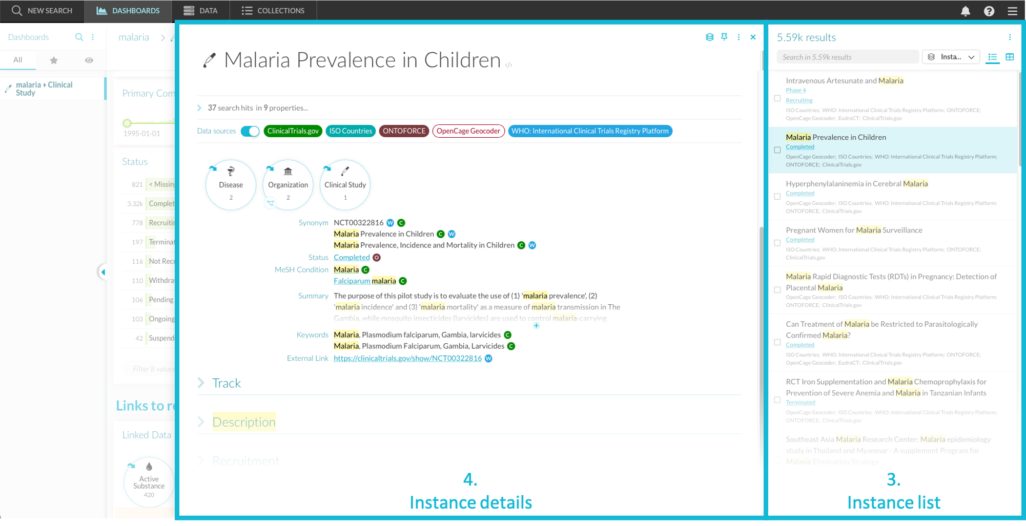
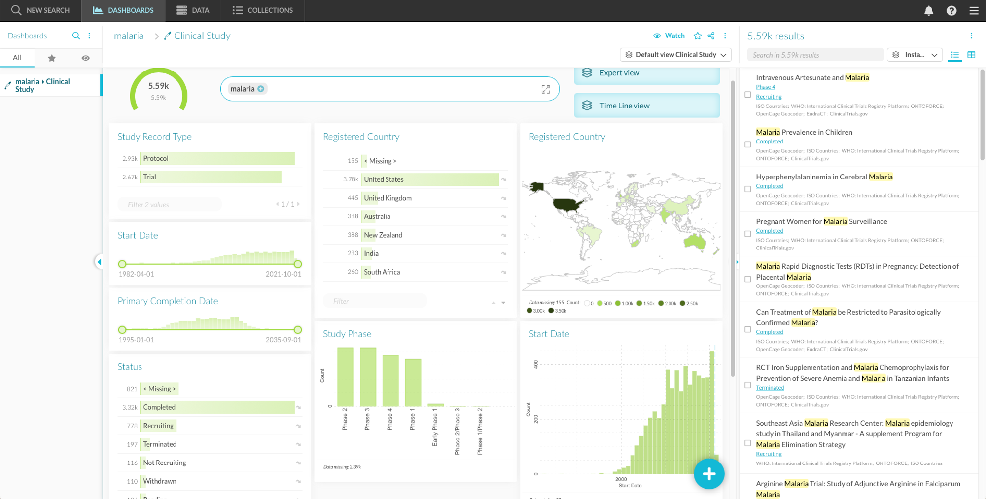
Figure 3.1 The dashboard environment: the dashboard overview on the left, the widgets area in the middle and the instance list on the right.
3.2. Instances
3.2.1. Instance list / table
On the right side of the screen, a list of search results (”instance list”) is shown. This list contains all instances that match your query. If this list is not visible, you can toggle the triangle ( ). To hide the list, toggle
  .
.
At the top of the instance list, you find:
- A results count
- Export (selected) instances as a CSV or XLSX (
 )
) - A search bar
- Templates and customization option ()
- Instance list menu ()
- The option to dock the instance list to the right or bottom of the screen
- Add and remove instances from a collection
- Show the data sources that contributed to each shown property of the instance by toggling the switch
- Enter technical mode to see the URIs of the properties by toggling the switch
- Sort instances by relevance or property values (ascending or descending)
- The option to switch between a list and table view.
Unless otherwise specified, instances are listed according to their relevance with semantic hits, if present, at the top and emphasized with a label.
By default, all instances are selected, but users can select individual instances by clicking the square checkbox next to their entry in the list. When one or more instances are selected, the dashboard is updated, and all subsequent actions are performed only on this selection. A new icon,  , appears at the top of the list. To re-select all instances, click this icon.
You can sort the instance list via the options in the instance list menu or by clicking the column header of the instance table. In the instance table, it is possible to sort by multiple columns. The last clicked column then becomes the primary sort, while previously clicked columns are secondary ways of sorting.
You can also filter the instance table by clicking on the filter icon ( ) in the column header.
You can export the instance list as a CSV or XLSX by clicking the “export” button (). You can then select which properties to include in the download, enter a file name and choose a file type. After clicking “export” to start the conversion, the notification icon ( ) on the main menu lights up. When the conversion is completed, you get a notification and you can download your file directly from the notification menu.
Upon clicking a specific instance, a pop-out appears that contains more information about this individual instance.
Example
When searching for malaria in the canonical type “Clinical study”, the instance list consists of clinical trials related to malaria. In the example below, “Malaria Prevalence in Children” and “Intravenous Artesunate and Malaria” are selected.
3.2.2. Instance details
The instance details pop-out shows additional information about the instance. At the top of the pop-out, you find:
- Template options ()
- Share instance
- The option to pin the instance in a new tab in the dashboard overview (
 )
) - Instance pop-out menu ()
The share instance button will generate a URL you can share with anyone in your organization for direct access to this instance.
Below you find a short overview of elements within the pop-out. Most elements within the pop-outs can be customized, as described in section 4.4. To open a print-friendly version of the instance details pop-out, click print icon ( ) in the instance pop-out menu ().
Name
The header of the pop-out is the instance’s name. Clicking the URI icon ( ) next to it reveals a list of URIs. These are the unique identifier(s) used to define instances. URIs have an appearance similar to URLs (hyperlinks), as URLs are a subset of URIs that identify websites.
Data sources
Below the preferred label, you can see the data sources that have contributed to this instance. As the information shown in the instance list is customizable, the pop-out does not necessarily contain all available properties. If a data source contributed to properties that are visible in the current instance pop-out, it is shown as a solid tag. Data sources that contributed to properties of this instance that are currently invisible, are shown as a hollow tag (Figure 3.2).

Figure 3.2 Four data sources contributed to this instance, but only ClinicalTrials.gov and WHO contributed to properties that are currently visible.
Toggling the switch ( ) color-codes the sources and puts small annotations next to the properties. These color-codes show you from which sources each piece of information originates (Figure 3.3). By clicking their name, you can select and deselect data sources to restrict the displayed properties to those that were provided by specific data sources. This selection retains when you click other instances afterward. To clear the selection, you click the filter icon next to the data sources.
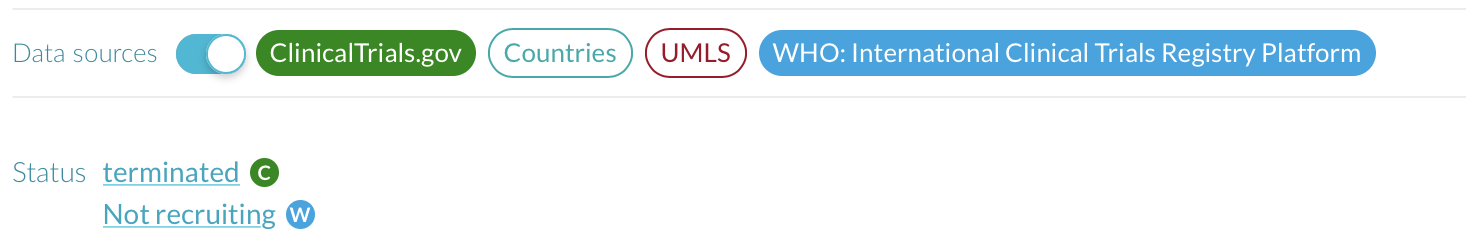
Figure 3.3 Color-coded provenance of properties.
To see a text box containing a description of each data source, you click the small annotation belonging to this source. Clicking  in this text box opens a page with additional information on the data source (section 6).
Example
The information on the clinical study “Malaria Prevalence in Children” originated from 5 sources.
Other instance details
Depending on the active template, the instance detail pop-out can contain more information. Examples include charts, synonyms, descriptions, scientific information or external links. To learn about template customization options, see section 4.4.
Example
The study “Malaria Prevalence in Children” is a completed clinical study.
3.3. Widgets
Widgets provide an overview of properties for the current selection of instances, allowing visualization and filtering. The properties that can be shown in widgets are called facets: these are properties of which the values are not necessarily unique. Facets can be shown in the dashboard or in the instance details while other properties can only be shown in the instance details.
For example, instances belonging to the canonical type “Clinical Trials” have a property “Study Phase” that is used as a facet. As the possible values for this property are limited, you can make a bar chart showing the number of clinical studies in each phase. You can then select a phase of interest and apply it as a filter to the instance list. On the other hand, the property “ID” is unique for every instance, and is therefore not a facet and is only displayed in the instance details. In DISQOVER, 5 types of facet data can be turned into widgets, and the type of data determines the possible visualization methods (e.g., bar chart, map, table,…):
- Categorical (CAT), for example, the study phase
- Date (DATE), for example, the completion date
- Integer (INT), for example, the number of enrolled people
- Floating point value (VAL), for example, the duration of the study
- Country (CTRY), for example, the countries where the research facilities are located
- Location (LOCATION), for example the region (state, county) in which the research facilities are located.
- Coordinates (COORDS), for example, the geographical coordinates of the research facilities.
Widgets fall into four categories: “filter”, “analytics”, “instances” and “other”. Below, you find a short overview of the available widgets. You find a complete overview in section 5, which includes the options available for each widget.
Example
The default Clinical Study template for malaria already contains several useful widgets. If you have selected specific instances, click to re-select all instances.
You can see most studies are completed. On the map, you see that many studies are conducted in the United States.
3.3.1. Types of widgets
Filter Widgets
Filter widgets facilitate filtering, by allowing you to base your filter on selected facet values. See also section 5.1.
- Keyword search: a text search field
- Property search: a text search in individual properties
- List facet: a list of facet values
- Compact list facet: a pop-out list of facet values
- Tree facet: a nested tree of facet values
- Compact tree facet: a pop-out nested tree of facet values
- Range slider filter: min/max filter on top of a histogram
- Data filter: a search field for a range of calendar dates
- Numerical value filter: a search field for a range of numerical values
Analytics Widgets
Analytics widgets are a more visual representation of the facet, although they can also be used for filtering. See also section 5.2.
- Bar chart: the number of instances per categorical facet value as vertical bars
- Pie chart: the number of instances relative to the total for each categorical facet value
- Multistate chord diagram: the relationship and relative occurrence of multi-valued categorical facets
- Histogram: the number of instances per bin of the numerical value facet on the x-axis
- Date histogram: a display of the instance numbers with time on the x-axis
- Region heat map: the number of instances per region on a map
- Country heat map: the number of instances per country on a map
- Country symbol map: the number of instances per country shown as a disk on a map, its size relative to the total number
- Dot distribution map: displays instances on a map as dots
- Heat map: Heat representation of instances on a map
- Dual value histogram: a display of two facets as rows and columns, the size of the scatter determined by the number of instances.
- Aggregated value: the average, minimum, maximum or total of a numerical facet
- Scatterplot: a plot ordering instances based on the values of two numerical facets
- Pivot table: a table with two facets as rows and columns, with the cells color-coded based on the number of instances in them
- Clustered bar chart: the number of instances per value of a first categorical facet shown as vertical bars, grouped by a second categorical facet
- Box & whiskers chart: a summary of the average value, standard deviation and range of a numerical facet, grouped by a second categorical facet
- Violin plot: a plot showing the distribution of a numerical facet per categorical values
- Sankey diagram: the correlation between two categorical facets
- Parallel coordinates: displays a number of numerical facets on a parallel vertical axes
Instances Widgets
These widgets show properties for specific instances. See also section 5.3.
- Property list: a list view of instances
- Stacked time periods: a visualization of instances using their start and end date, with time on the x-axis
- Instance pivot table: a table showing the facet value for each instance
- Stacked cards view: a visualization of instances as cards stacked in columns
Other Widgets
These widgets are not related to individual properties. See also section 5.4.
- Count: the number of filtered instances relative to the total number of instances in the instance list
- Search path: an overview of the search history used to build this dashboard
- Configured links: an overview of configured links that you can follow(section 3.3.3)
- All links: an overview of all links to canonical types that you can follow (section 3.3.3)
- Separator: a horizontal line
- Header: the option to add a (section) header to the dashboards
- Static text: the option to add text to the dashboards
- Instance list linkout button: a button that opens an URL link containing the instance list table
- Open template button: a button that automatically opens the dashboard in a predefined template
- Collection membership: the option to filter the instances to those that are member of one or more collections
- Collection links: the option to filter the instances to those that are linked to one or more collections
- Color legend: a legend that shows the color code of a categorical facet.
3.3.2. Filtering
You can use filters on widgets to narrow down the instances displayed in the instance list. Filters are automatically applied to the entire dashboard. In section 5, there is a more detailed overview of filter specifics for the individual widget types.
The currently active filters are shown underneath the dashboard title. You can also remove filters here. When you use a specific widget to filter your results, a filter icon () appears in the widget’s heading. Using this, you can see which filters are active in this widget.
Using filters
To filter, you click the facet value you want to filter on. This opens the filter menu (Figure 3.4) where you can specify the filter’s logic:
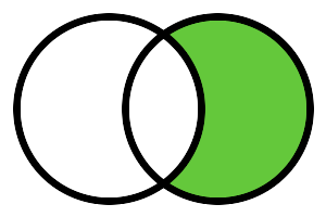
- Set as filter (
 ): instances are only shown in the instance list if their value for this property matches the chosen value.
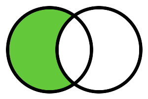
 - Exclude filter (
 ): instances are only shown in the instance list if their value for this property does not match the chosen value. When selecting multiple exclude filters, they are combined using AND logic.
 - Add to filter (
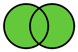 ): this option is only available if a filter is already applied to the widget. It combines the filters using OR logic. Instances are shown if their property value corresponds to one of the active filters.
 - Restrict filter (
 ): this option is only available if a filter is already applied to the widget. It combines filters using AND logic. Instances are only shown if their property value corresponds to all active filters.
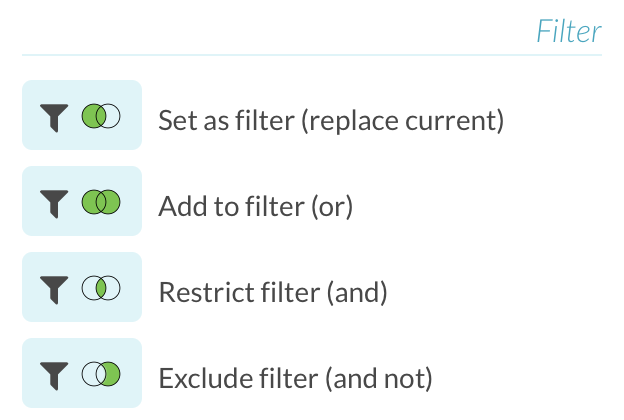
Figure 3.4 Overview of the filter menu, which lists the available filtering options for the selected property value.
Facets can be multivalued. For example, a clinical study can take place in multiple countries, leading to more than one value for the Country facet. When you filter for studies in France, you still see multivalued studies which occur in both France and Spain. To see studies exclusively in France, you need to use the Exclude filter on all other countries.
Example
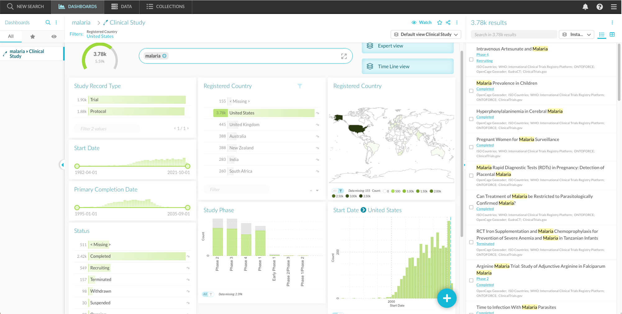
Using these filters, it is possible to show all malaria-related clinical trials in the United States selectively. Applying this filter limits the instance list to the selection and updates all other widgets. For example, most of the “Study phase” chart is grayed out, with only the portion that applies to the United States data still highlighted.
Restricting widgets and dashboards  
Setting a filter on a facet only affects the facets widget and the instance list. To apply the filter to another widget on the dashboard, you open the menu of a specific widget ( at the top of the widget) and click “Restrict to filter”. To apply the filter to the entire dashboard, open the dashboard menu ( at the top of the dashboard) and click “Restrict to filter”.
You can remove a widget restriction from the widget menu, and a dashboard restriction from the dashboard menu.
Example
With the US filter for malaria-related clinical trials still active, clicking “Restrict to filter” in the menu ( ) of the “Start date” histogram removes the gray part of the bars. The widget now only shows the histogram for the 3.78k clinical trials in the United States.
Clicking “Restrict dashboard” in the dashboard menu ()restricts all widgets on the dashboard to the filter.
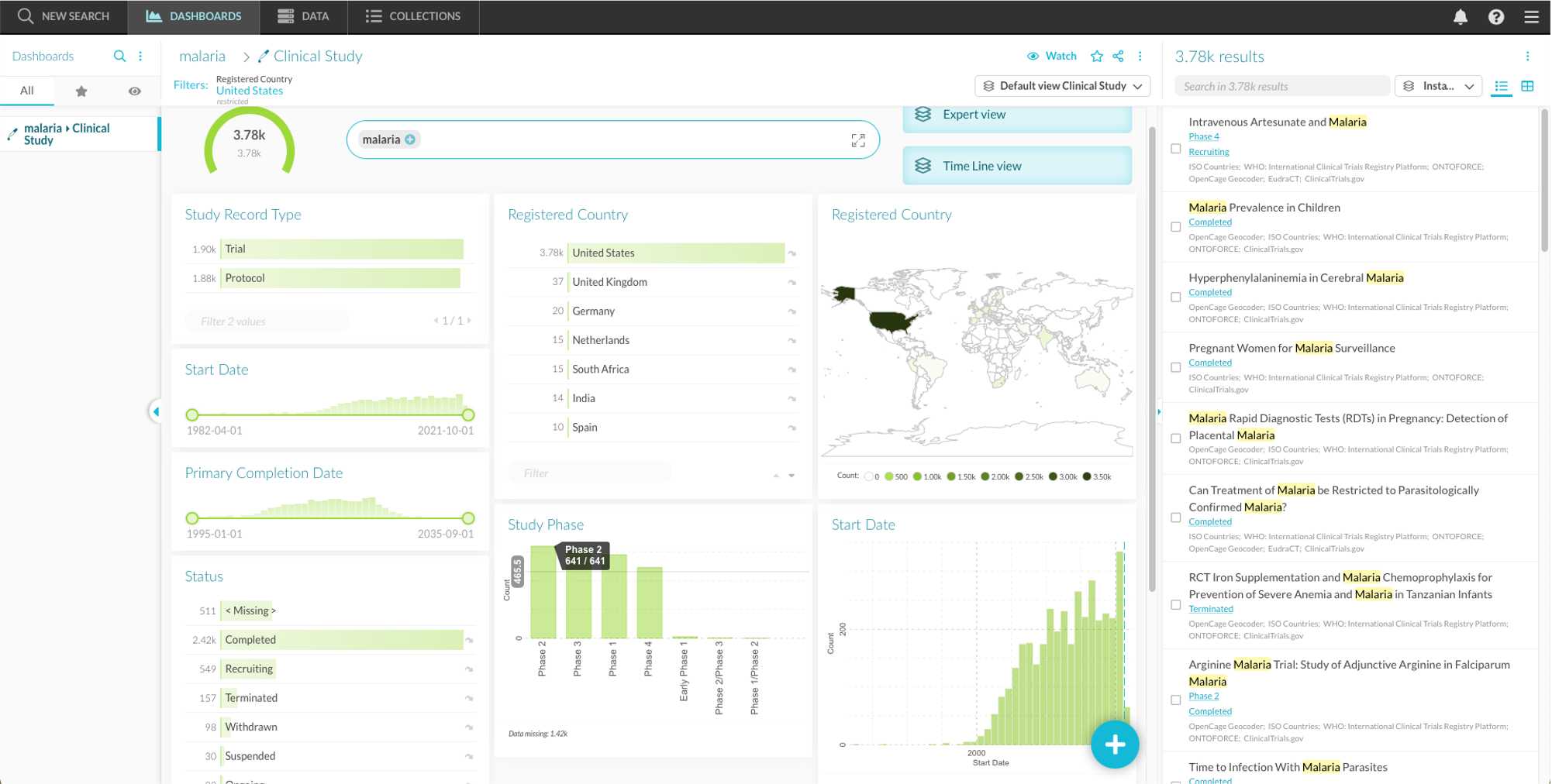
Please note that removing an active filter from the dashboard does not remove the filter from the restricted charts. You can use this functionality to simplify charts in your dashboard before applying additional filters to the results. Similarly, you can apply filters to a selection of widgets in the dashboard. To do so, create a filter, restrict the widgets that interest you, and then remove the filter from the dashboard.
3.3.3. Following links
It is possible to follow links between related instances to continue a search in new directions, moving from one canonical type to the other. When one or more properties of an instance are related to another instance, these instances are “linked”. For example, some properties of instances within the “Clinical study” canonical type refer to instances in the “Organizations” canonical type.
Two types of links
There are two kinds of links:
- Untyped link: these are connections between instances without information on the kind of connection.
- Typed link: these do not only convey a connection between instances, but also the nature of their connection. For example, starting from the disease Malaria and following the typed link “is indicated for” to the “Active substance” canonical type, you find the active substances indicated for malaria.
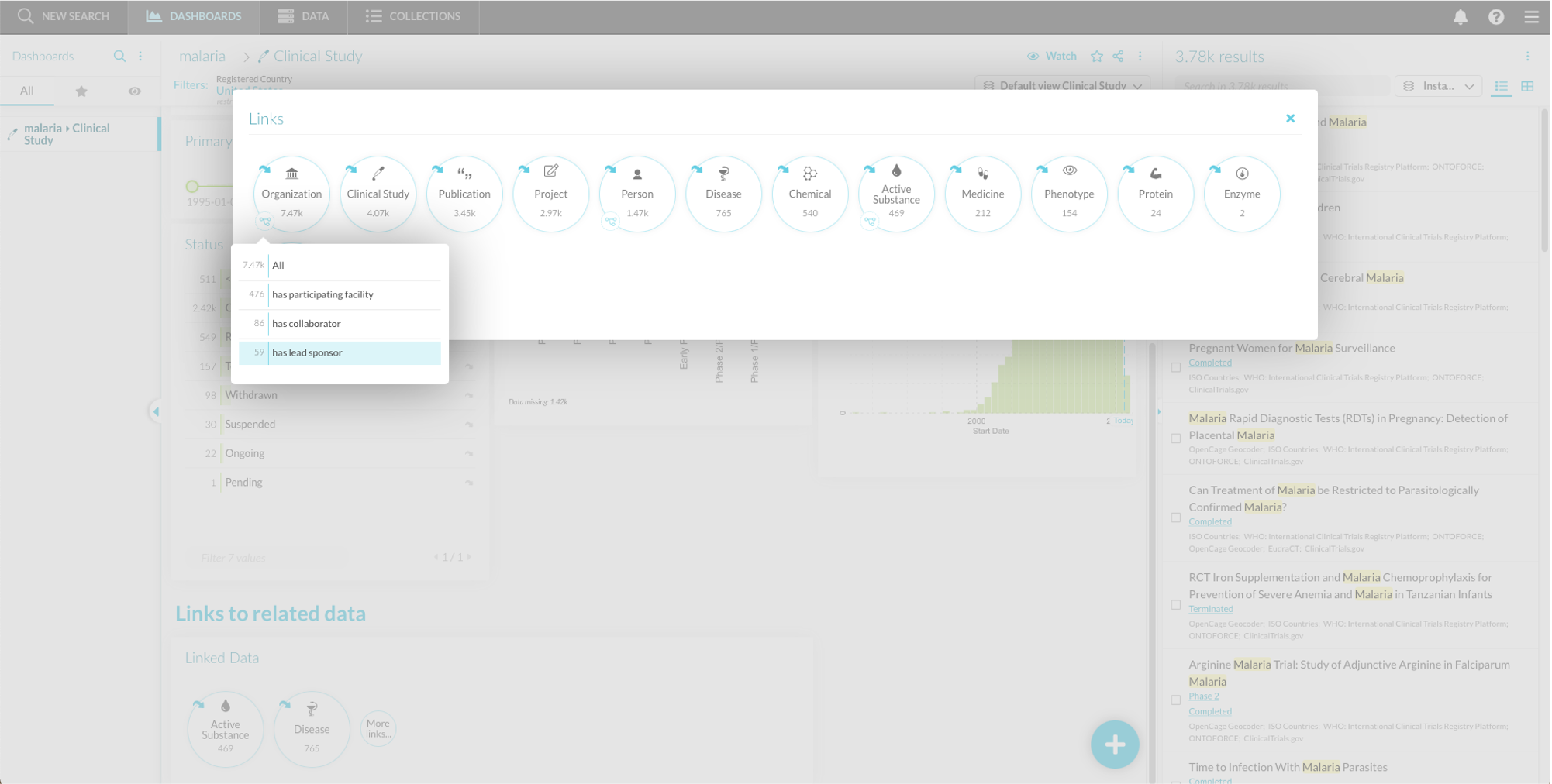
To follow an untyped link to a canonical type, you can click the tile within the “All links” or “Configured Links” widget. To follow a typed link if one is present, click the link icon ( ) below the tile.
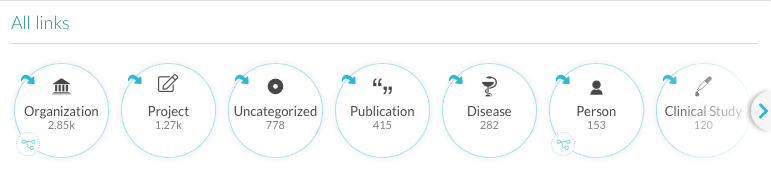
Figure 3.5 The links widget shows linked canonical types. It can show all links or a preconfigured subset.
After following a link to a canonical type, a new dashboard opens with a new list of instances from this canonical type. The search journey in the header is updated.
Example
At this point, the instance list consists of all malaria-related clinical trials in the United States. Using the “Links” widget, you can pivot your search and look for the organizations that were a lead sponsor of these studies.
To do so, go to the “Organization” tile in the “Links” widget, click the link icon () and select “has lead sponsor”. Depending on your dashboard configuration, you can find this typed link:
- Within the “All Links” widget.
- Preconfigured in the “Configured Links” widget.
- After clicking “More links” in the “Configured Links” widget.
If there is no links widget on your dashboard, you can add one (see Creating new widgets).
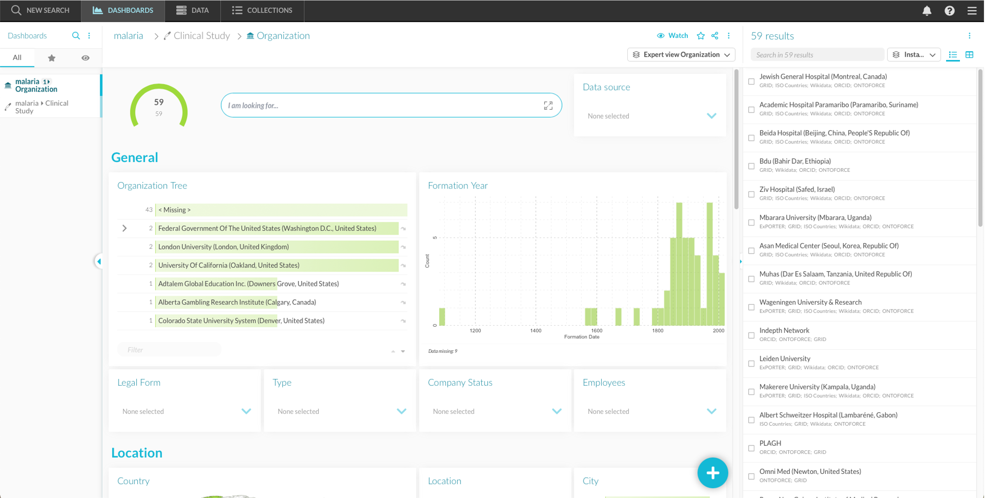
A new dashboard opens, and the instances are now the 59 organizations that sponsored malaria-related clinical studies in the United States.
Association canonical types 
In some cases, there is more information available on typed links, for example the evidence on which the link is based or the sources that contributed to the link.
This additional information can be visualized in a canonical type, called an association canonical type. For example, instead of following a typed link between Disease and Gene, you first follow the link from Disease to the Disease-Gene association canonical type. There, you can filter on links stemming from a certain source. After that, you follow the link from the association canonical type to the Gene canonical type.
The availability of association canonical types depends on your DISQOVER configuration.
3.3.4. Customizing the widgets  
Creating new widgets
A default dashboard contains preset widgets, but you can add others using the “Create new widget” button () in the dashboard. This opens a “Create a new widget” panel ( Figure 3.6 ). The customizability of the dashboard can be turned on or off by switching the “Locked” switch within the dashboard menu ().
On the left-hand side of the panel, you see the available facets for this canonical type and their data type. Toggle the switch to select those of interest.
You can quickly search for available facets by using the search input field. In the menu (), an option is available to show the data provenance of each facet.
On the right, you see the available chart types for the selected facet(s). The charts are divided into different tabs: All, Filter, Analytics, Instances, Plugins (when available) and Other. A search input is available to quickly search for existing chart types.
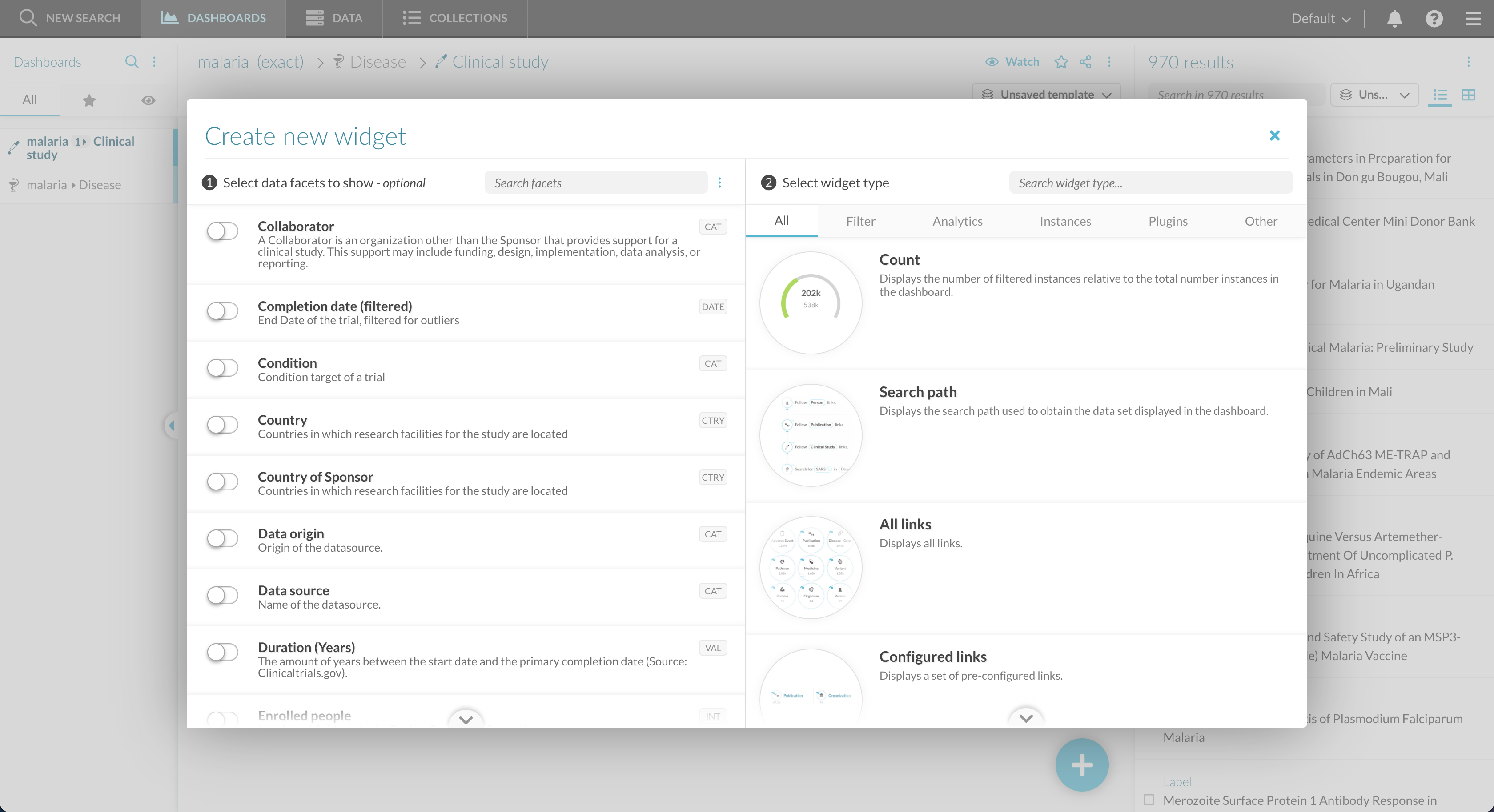
Figure 3.6 The “create a new widget” panel. On the left, you can see the available elements for this canonical type. On the right, you see the suggested chart types.
Charts require specific types of input data. DISQOVER shows which data is still missing to build a certain type of chart.
Instead of manually selecting a chart type for each facet, you can select multiple facets at the same time and choose the option “Individual filter widgets” to let DISQOVER add the appropriate filter widget for each facet.
Example
If you are interested in seeing clinical study phases by country, you could add this information to the clinical study dashboard in the form of a Country symbol map. To do so, open the “create new widget” panel, go to the “Analytics” panel and select both facets of interest: Country and Study Phase. The Country symbol map widget is automatically suggested based on the data types of these facets. Clicking the widget type adds it to the dashboard.
Widget lay-out
Using the chart settings (), you can make changes to the widgets. The specific possibilities depend on the type of widget, but options include:
- Change the widget’s name
- Restrict the chart if filters are active
- Change the data shown on the chart
- Choose secondary data to add to the chart
- Let the widget update when a filter is applied to the dashboard, or keep the content of the widget static regardless of applied filters.
- Adapt the layout
- Choose a default or transparent background
- Show or hide the header ()
To change the size of a widget, you click and drag the icon  in its bottom right corner. To move a widget, you click the header and drag it to place. The other widgets automatically adjust.
When a filter is applied to the dashboard, a switch appears on some widgets. With it, you can choose to let the widget dynamically update with the filter (), or have the widget show all data (All). If a restriction is applied to the chart or dashboard, the All option shows the restricted data.
3.4. Watched dashboards
Due to the dynamic nature of data, the results of a search journey can change over time. New publications are released, clinical studies transition through different statuses,… Data updates can affect any step of a search journey and the resulting instances.
To remain up to date on these changes, you can watch a dashboard. When the instances in a watched dashboard change, you receive an (email) notification. You can also see which instances were added to or removed from the result list, and when this data update occurred.
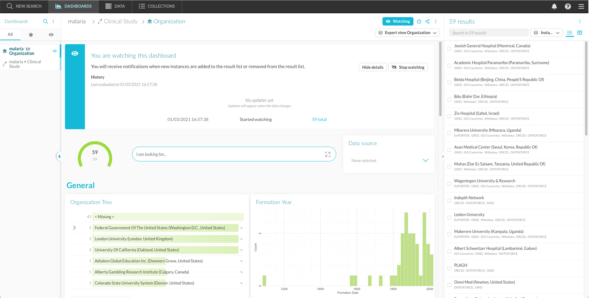
To watch a dashboard, click the “ Watch” in the dashboard header. An information box appears and lets you see the history of added or removed instances, either per data update or aggregated over multiple data updates. When you click the numbers, a new dashboard opens containing the added or removed instances.
Example
Click “ Watch” to start watching the Organization dashboard of sponsors of malaria-related clinical studies. If this list of 19 organizations changes, you will receive a notification. This could for example happen when a new study about malaria is started, and has a sponsor that was not previously included in the list.
Notifications can be messages within DISQOVER, emails or other services such as Slack. This depends on the configuration made by an administrator.
Some remarks:
- Only the addition or removal of instances lead to a notification. You are not notified when property values change, unless a changed property value causes the addition or removal of an instance to the dashboard.
- Emails and other notifications or actions are configured by an administrator. Their frequency and message are customizable.
- You cannot make changes to a watched dashboard. Once you are watching, you can no longer change the filters or add widgets. When trying to do so, you are prompted to open a new, unwatched copy of the dashboard where you can make changes for further exploration.
- When you stop watching a dashboard, you also remove its history.
- Instances can be removed from a watched dashboard for two reasons: because they no longer are a result of the search journey (for example when their property values change) or because they are completely removed from DISQOVER (for example when they are removed from the source data) and therefor no longer available. In the latter case, you are still notified of the change but can no longer see the removed instance. The count of removed instances is then higher than the number of removed instances you can see in DISQOVER.
- If the number of instances in one of the steps of the search journey exceeds a threshold, any followed links are truncated and you receive a truncation warning in the dashboard header. The watched dashboard is then no longer usable (because it would not accurately reflect data changes) and you receive a warning.
- There are some limitations to watched dashboards that depend on your DISQOVER configuration. There is a maximum number of watched dashboards per user (10 by default) and a maximum instance count per watched dashboard. When exceeding these, you receive a warning.
3.5. Dashboard settings 
Your current dashboard is shown in the center of the screen, with its name at the top. You can star a dadhboard by clicking the star icon  and share a link to the dashboard by clicking the share icon. Several options are available through the dashboard menu ():
- Rename the dashboard
- Refresh the dashboard
- View the dashboard in full screen mode
- Archive the dashboard
- Restrict the dashboard to the active filter(s).
Dashboards are by default named after their search path summary, but you can customize the dashboard name from the menu.
The expandable “Dashboard layout” section offers some options to customize the layout of the dashboard and widgets:
- Locked: disables the customization of the widgets and dashboard
- Responsive dashboard layout: automatically adapts the dashboard to changing window sizes by repositioning the widgets
- Auto compact widget positions: automatically compactizes the dashboard by applying ‘reverse gravity’, meaning widgets move towards the top of the page if there is empty space available
- Show chart grid lines: wherever applicable, displays vertical and horizontal grid lines on charts
- Show current date on charts: indicates the current date on analytics or instances widgets that contain dates
- Show hover labels: wherever applicable, shows a text box containing additional information when hovering over chart elements
- Show hover value lines: wherever applicable, shows a moving guide line and the x and y value when hovering over graphs
- Edit layout mode: opens a compact overview mode which shows all widgets on the dashboard, their titles and sizes. You can change the settings (), size or position of the widgets. This way, it becomes easier to change the global layout of the dashboard. You can see the content of each widget by clicking the magnifying glass (
 ).
). - Fit to view: instead of a vertically scrollable dashboard, the dashboard height is equal to the height of the window, and widgets are compressed or extended vertically (retaining their relative height to one another) to fit the window height.
- Flat view: there is no color difference between the widgets and the background
3.6. Managing dashboards
3.6.1. Your dashboards
Changing canonical type
Everything shown within a dashboard is specific to a canonical type. You can change the canonical type through the search summary at the top of the dashboard. When you hover over the name of the current canonical type, a pop-up opens. From there, you can click the name of the canonical type again and change it.
This opens a new dashboard, with the same search terms and linking history as the previous one. Filters applied in the changed canonical type are not retained.
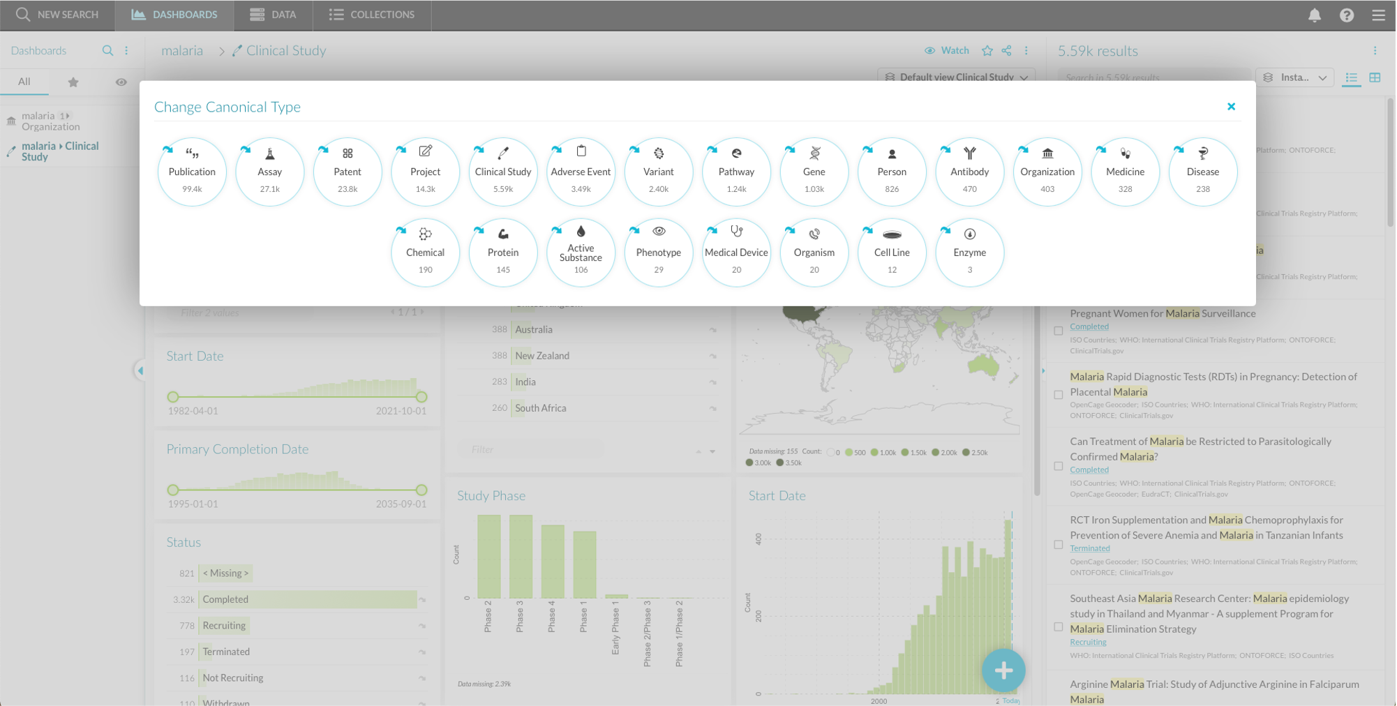
Figure 3.7 The “Change Canonical Type” pop-up window.
Dashboard overview
Dashboards are saved automatically and listed in the dashboard overview as tabs on the left side of the view. From this overview, you can navigate between existing dashboards by clicking their respective tabs. A search bar at the top allows for quick searching dashboards by name (). Via the icon, you can view archived dashboards or remove all unstarred dashboards. You can choose to see all dashboard, starred dashboards () or watched dashboards ().
When hovering over dashboards, you can close them ( ). Closing a non-archived dashboard is the same as deleting it. Archived dashboards can be re-opened or deleted via the icon.
Discovery overview
DISQOVER facilitates complex searches in which you can consecutively apply filters and follow links between concepts. In such a complex search, different search steps are represented by individual dashboards.
The dashboard overview (Figure 3.8) automatically groups tabs of dashboards within the same search. The Discovery overview shows a schematic overview of your complex search by showing different dashboards as tiles and the links between them as arrows. To access the Discovery overview, click the icon () at the top of a group of dashboards.
You can navigate to a specific dashboard by clicking its tile or delete a dashboard by clicking close (). However, dashboards that lead to other, still opened dashboards cannot be deleted but are instead grayed out and can be reopened.
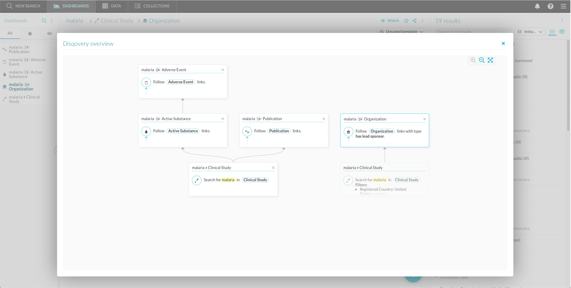
Figure 3.8 The Discovery overview of a complex search. The dashboards in the dashboard overview are represented as tiles connected by arrows.
3.6.2. Templates and saved dashboards
As mentioned before, there are 4 ways of saving dashboards in DISQOVER. A dashboard consists of the widget configuration, active filters and a list of search results. A template contains the widget configuration and active filters, but no fixed results list, meaning it can be applied to future searches.
- All dashboards are automatically saved and visible in the dashboard list. Removing a dashboard from this list permanently deletes it.
- Starred dashboards strongly resemble normal dashboards. Removing a starred dashboard permanently deletes it, but gives a warning message first. It is possible to declutter the dashboard list by removing all non-starred dashboards.
- Archived dashboards are saved and accessible via the icon () in the dashboard list, even when they are deleted from the dashboard list.
- Templates can be opened using the template icon () at the top of the dashboard. This then opens a new dashboard layout containing the same data as before. From ‘My templates’ in the main menu (), you can see and manage all saved templates, both local (only visible to you) and global (visible to all users). From this overview, you can also set your own default templates or choose the system default template.